balsa
Redesigning a website for first time home buyers
Role
In a team of 5, I focused on comparative research & synthesis and lead UI research and design.
Date
3 weeks in 2021
Company Overview
Balsa is a real-estate company that focuses on supporting first time home buyers.
Problem
Balsa’s current website doesn’t convey information about the value and services that balsa provides. The CTA on the main page takes users away from the site.
Goals
Communicate the company mission and value for first-time users
Allow users to quickly locate the valuable tools and services
Design a new look that’s fresh and trustworthy
Business Research
There is a world of information when it comes to home buying. It is also important to understand what our users know and value. Our team decided to duo-path comparative analysis and user interviews.
Comparative Analysis
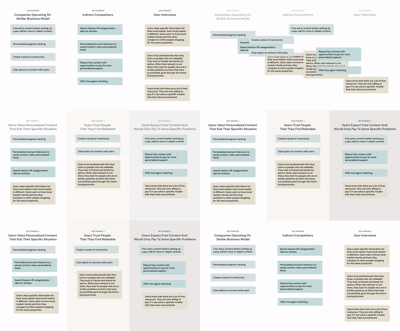
My teammate and I worked with the stakeholder to identify companies that operate on a similar business model and companies that are indirect competitors. We created feature inventory lists and pluses/delta charts to synthesize our findings.
Research Synthesis
While we did the comparative analysis, another team focused on user research. We synthesized all the results with affinity mapping
User Persona
Two user groups are apparent — The primary persona is a user who is just dipping his/her toes in and browsing; The secondary persona is a user who has done enough browsing and is ready to purchase a property.
Redesign
balsa didn’t have an existing branding system. Before we designed the website, I put together a moldboard so we can follow it to create a cohesive design system.
Home Page
As a gateway to balsa, I wanted the home page to convey balsa’s mission and allow users to find the most valuable content right away. During user interviews, we had users rank the services that balsa provided, and we used that ranking to create the hierarchy of the home page.
“Who is balsa and why should I use it?” - Working with the founder, I broke down balsa’s mission and outlined the journey the first time homebuyers will take if they engage with balsa’s services.
CURRENT HOME PAGE
NEW HOME PAGE
Onboarding For Financial Planning
The most valuable free tool that every potential user has identified is the suite of financial planning tools. However, the tool requires users to do some homework before starting and most users are caught off guard and quickly get overwhelmed. I designed a step-by-step onboarding so users understand exactly what’s to come and why they are asked for certain information.
CURRENT TOOL WITHOUT ONBOARDING
NEW ONBOARDING
Financial Planning Tools
The financial planning tool is currently a downloadable excel form. There are certain fields that are auto-generated depending on the user’s input, but the current design doesn’t inform the users what would happen. The web version separated the required fields from the generated fields, so the user won’t be overwhelmed by the number of inputs.
CURRENT EXCEL TOOL
NEW WEB TOOL
The Prototype
Explore the latest prototype and group some accounts!
What did I learn?
Be transparent with the stakeholder. As the point of contact between our team and the stakeholder, I decided early on to keep our stakeholder informed of our project plan and research findings. This prevented confusion when we updated the hierarchy of the services provided.
Be ready to adapt when research findings don’t support the company business model. There is always a way to bridge the gap.
What can I consider?
How might we distinguish early on if a user is ready to purchase a home?
How might we offer a peek into what paid services can do for the users?
How might we encourage users to keep balsa agents in the loop during their home buying journey?


